Kitchen Remodel | Deerfield

Job Summary:
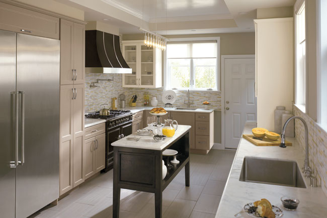
This Deerfield kitchen renovation shows how you can still create an efficient and attractive design - including a kitchen island - in a narrow kitchen space. Rather than leaving a bunch of unusable empty space in the middle, we created a moveable, furniture-like island that can be used wherever and at whatever angle works best at any given time. Elevating the island, a bit and creating an open space at the bottom, goes a long way towards freeing up the view and making the room look more open and spacious.
Creative soffiting to hide plumbing, can be done to look as if it's a decorative ceiling element rather than an obvious solution to an obstacle. In this case, we trayed the center of the ceiling, providing an artistic touch.
Cabinetry Style:
This is a transitional kitchen design showcasing the Renner door style for the perimeter and a Provincial door style on the island. These cabinets are part of the Dynasty/Omega cabinet line, offering semi-custom cabinets that can be paired with fully custom cabinets. The framed cabinetry showcases a full overlay door to minimize door margins, and they also provide a more custom look.
Cabinet Finish:
The perimeter cabinets were finished with a standard matte paint called Oyster. The island is painted Portabella with a black glaze. Both of the finishes were painted on maple wood.
Countertops:
While marble is a gorgeous option, it can be tough for high-traffic kitchens since it's prone to nicks, scratches and stains. Instead, a ultra-durable route was selected by using a DIFINITY Quartz countertop, called Viareggio, that looks like marble but will be much more durable and easier to maintain - no sealing required! The full bullnose edge provides a softer edge detail, eliminating blunt, sharp edges.
Backsplash:
We take advantage of modern innovation when we can, which is why a Walker Zanger glass mosaic tile was selected for the backsplash that comes on 12 x 12 mesh sheets for easier installation. Different colors and sizes add subtle color and interest.
Flooring:
Flooring material, size and layout should always take a room's dimensions into consideration. In this narrower kitchen space, we used 12 x 24 porcelain tiles that run the length of the room, making it look bigger.
Appliances:
There's two ways to go with a range hood: show it off or blend it. For this kitchen renovation, owners opted to make a statement with a hood that draws the eye with black metal and stainless steel trim that pairs perfectly with the range, yielding a "wow" factor.
The professionals here at Kitchens & Baths Unlimited are kitchen remodeling experts who anticipate helping you to design your own "wow" factor. Contact us today and let's get started. (847) 729-1212.


